Resume 5.0: The new face of CV

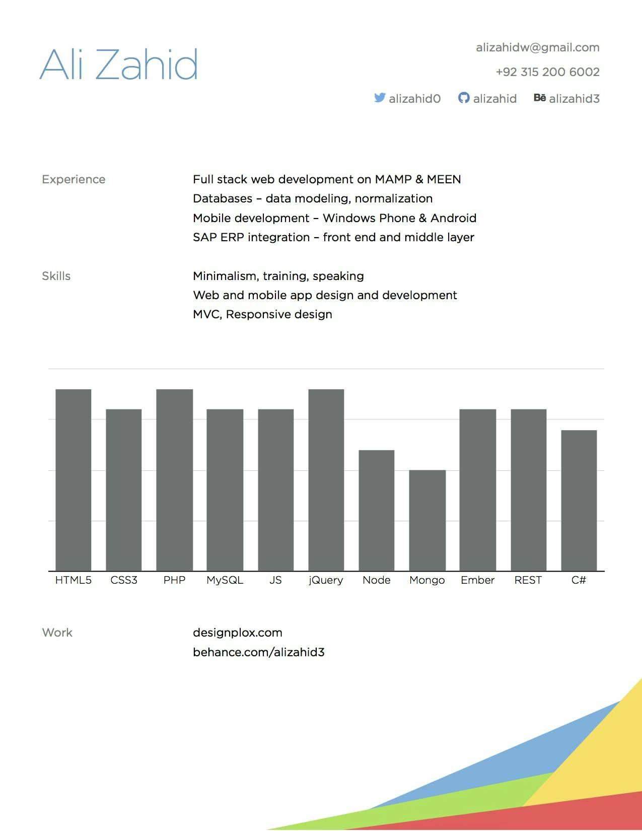
I just posted this sample CV on SkillCity‘s Facebook page as an example of a futuristic resume.
Within minutes, comments started to pour in and post shares started. Seeing this interest, I thought this needs to have a wider circulation beyond a Facebook Page. So, why not a blog post?
There is one BIG question on what to put in in the new CV (I must admit that Resume 5.0 is only a term made jokingly because we don’t know what the Resume 2.0, 3.0 and 4.0 would look like). But with Resume 5.0, we have gone straight into the future.
My Dubai-based son, Ali Zahid, ceo of designplox.com, is a minimalist. Anything which does not contribute to the core message is thrown away. Brutally. He lives and travels out of a cabin-size suitcase.
Ali thinks the future resume will be visual, with a lot of white space, and with only minimal but critical info. It would fit nicely on about a half A4, or an A5.
One commentator said: what about the academic qualifications? Ali thinks his recruiters (job, or project) don’t give a damn about his dropped out BS in Computing from Szabist (where ironically I taught too, but in business school). So he’s good (i.e. won’t put it on paper or even mention it in resume).
And it’s not coincidence that the recruitment experts too are saying this. This from yesterday’s LinkedIn.
Many other commentators asked if a CV like this would work the same way for Finance, Audit, Marketing, BD, Customer Service jobs and generate optimal results or offers? To this, Ali replied:
“At first look, you see the chart and the colorful shape. But it doesn’t end there. Defining meaningful sections, using less text, proper font type, spacing, size, readability; essentially, being minimalist is the point here.
I think that the results from a smaller, cleaner, minimal CV will be far better than a multipage, text-filled, Times New Roman one. What are interviews for, eh?”
To which came this objection: But who will take the risk and inculcate this in the minds of old-school head honchos in Finance, Audit, Marketing, etc, who still believe and blindly follow the traditional (read: ancient) CVs and verbatim associated with it?
My answer: This minimalist approach may not satisfy the recruiters' appetite in the short term until this goes big in fashion … however, for tech-savvy recruiters in IT, CS and Web, this could be a gem.
My feeling is that whatever the field, all future CVs would look like something like this, perhaps going through a continuum of Resume 2.0, 3.0, 4.0.
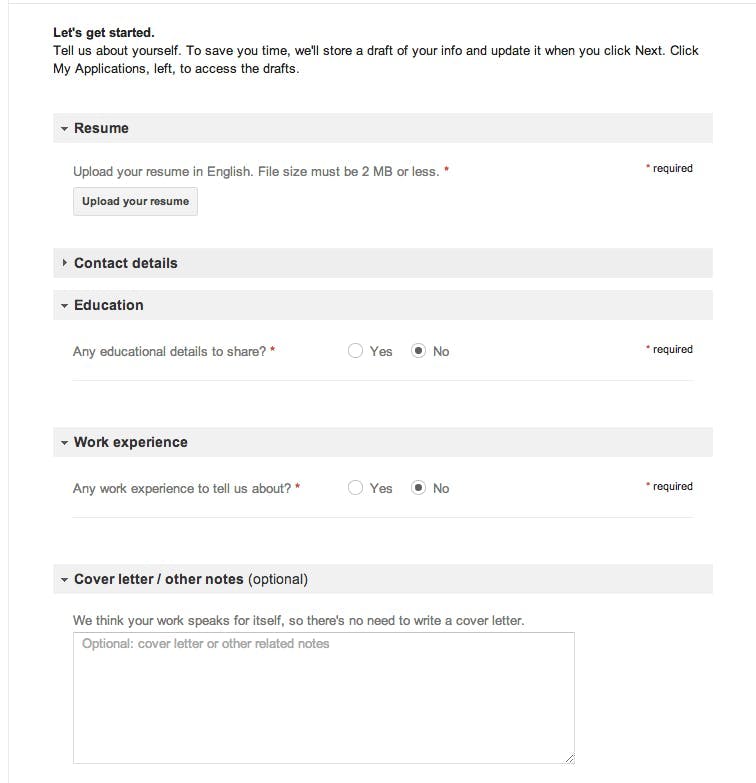
When companies like Google advertise their positions, columns about education, work experience and cover letter are mentioned as ‘Optional’. A screenshot for you:

So, have you made a Resume 5.0 for you, yet?

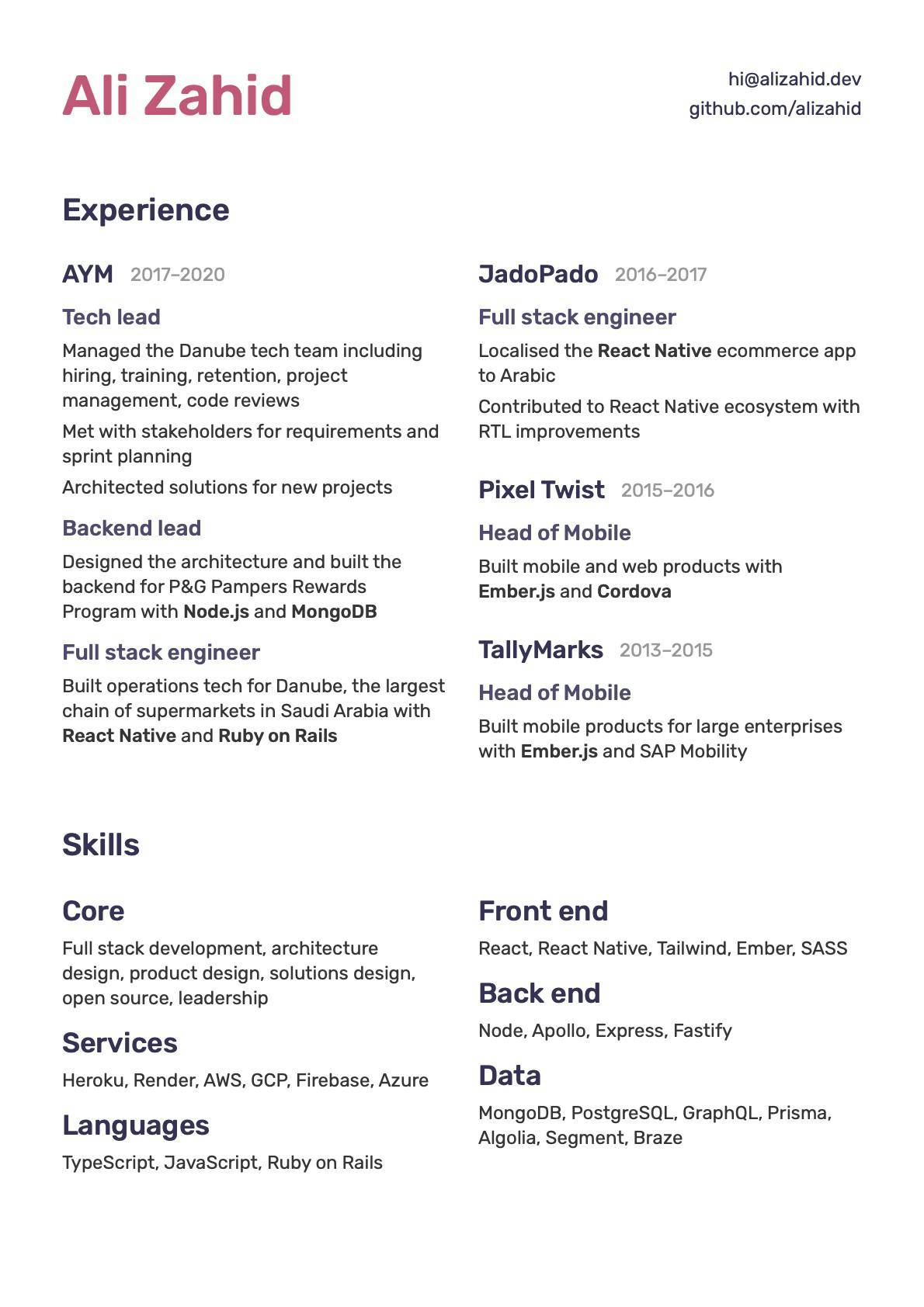
2020 update PS: As a thank-you note to Ali Zahid, we are placing his latest CV here. We can see that much of visual element is dropped off. Minimalism stretched further?

Wali Zahid
Wali Zahid is a longtime China watcher and a Pakistan futurist. An award-winning journalist, he writes on issues of significance to Pakistan and CPEC & BRI.